Top 7 Basic Graphic Design Principles
If you have never taken an art class and you don’t know art appreciation, you need to know about different rules of design.
If you are a professional graphic designer or you want to improve your photography skills, it is essential to understand the necessary visual design principles.
Don’t worry about terms like “graphic design principles” because these are just foundational theories that will help you in creating your piece of visual art even more appealing.
What are the Principles of Graphic Design?
When it comes to any art, there is no specific number of design principles. But graphic design is also a fundamental science that comprises particular rules and regulations that graphic designers have to keep in mind.
The technical side of graphic design is often in buzz in the online world. Thus, we need to know about the basics of graphic design and how to design graphics according to different principles.
These seven graphic design principles will help you to up-level your graphics.
- Contrast
Contrast refers to how different elements of design look after application of rules of design.
A contrast refers to the tone of black versus white, and contrasting colours are in the opposite position on the colour wheel.
You need to pay attention to the contrast in your design as you have to make sure that the subject of your design can contrast with the rest of the image so that your image can get enough focus.
Things that contrast with each other pops out and the image that you want to emphasize gets adequate attention.
- Emphasis
Emphasis means how things are apparent when compared to the overall composition.
If you know how to design graphics, you will understand that the elements that you want to make prominent are made clear and impactful.
If you do the emphasis part carefully, you will witness that the image is noticeable. Viewers mostly walk away with the message that graphic designers want to give.
But, when the emphasis part is not right, your viewers may not get a clear cut message and may think that something is wrong with the design. Under the rules of design, emphasis can be created in multiple ways.
For example, changing the scale can change the focus of design and use of contrasting colours, and the addition of elements like colours and designs can also create an emphasis.
- Pattern
Another central design element that you can’t neglect is the pattern of design. Our eyes are made in such a way that we see patterns in everything around us. Patterns occur everywhere in the natural world.
Use of pattern can help a designer to draw focus and attention to one subject in the design. Thus, the use of the pattern makes the whole composition stand out. Patterns mean repeated elements throughout the design.
If you want to include one of the essential graphic design principles, you will never neglect the use of patterns in your designs. Some of the significant designs in which you can use patterns include wallpapers, textiles, and backgrounds.
- Repetition
Repetition relates to different elements of the art. Thus, a replay can be about colour, pattern, shapes, or lines. The main aim of repetition under graphic design principles is to create consistency in the composition.
Use of repetition in your design will help you in making the entire frame beautiful and meaningful.
Most often, designers use the repetition principle to make something predictable and endless. For example, a repetition wave created on a piece of paper will seem like it goes on forever, even beyond the canvas.
Repetition rule is often used in the creation of beautiful User Interface designs. Under this, menus and colour icons have the same element repeated, again and again, to help the users find what they are looking for.
Also Read : Colour Psychology | Why it is important for designers
- Movement
In the sense of the elements of graphic design, movement is not the same movement you witness every day. Movement is not the object in motion under this circumstance.
Here movement means the direction of the viewer’s eyes on a composition. Most artists and graphic designers want their audience to control the movement of their eyes. They use different tips and tricks to do this.
Most often, designers use curved lines and diagonals to control the movement of the eye. In addition to this, some designers also use the shift between low-key and high-key colour to make the canvas appear in motion.
The rule of thirds and the golden ratio are other ways that artists use to show movement in their designs.
- Balance
Out of all graphic design principles, balance is the most important principle that no artist and designer can forget. Ratio means, the visual weight of all elements in a composition or design.
One of the most used balances is symmetry. Symmetry is all about reflection. In addition to the symmetry balance, graphic designers also use the asymmetry balance. Balance provides stability and structure to the overall design.
Different types of objects can balance an image. For example, a standing image can get the proper balance in composition by using white space. Balancing around a central point is the radial balance.
Thus, whenever you are creating a design, never forget to use the principles of balance in your design.
- Space
Space in design can mean differently as compared to the usual meaning of space. When it comes to graphic designing, space can be negative space as well as positive space.
Both of these are vital components that need to be present in your design. Both these spaces work closely, and it can affect the entire balance of your image or design you are creating.
Positive space refers to the area that is occupied by objects. Positive space is always full, and it consists of different elements.
On the other hand, negative space is the space that is available between the objects. Another name for negative space is white space. Another type of space in design principle is the copy space.
This space is that area that is empty and the designer can place their text in this space. Thus a proper balance between all these types of spaces is essential to create a perfect design.
Conclusion
In addition to all these basic graphic design principles, you can find different other types of principles. Some other principles include the idea of unity, hierarchy, scale, and rhythm.
Creation of designs may seem an easy task to viewers, but it is a complex task that includes different rules and principles. Missing one rule and principle can lead to a chaotic design.
Thus, it would be best if you used all these design principles in your design to create a beautiful and eye-catching design. It is essential to invest your time and energy in getting an in-depth understanding of all these elements and rules.
Graphic designing is much more than creating pictures; it is also about understanding the science behind the use of these rules and principles. Let us know if you want to know more about graphic design principles.
We hope this article will help you in getting enough information about the principles of graphic designing. Contact us to get more details.
FAQ's
1. What is the elements of design?
- The elements of design typically include line, shape, color, texture, space, and form. These elements are the fundamental building blocks of visual composition.
2. What are the golden rules of graphic design?
- The golden rules of graphic design often include principles like balance, contrast, alignment, repetition, proximity, and simplicity. These guidelines help create visually appealing and effective designs.
3. What are the visual design elements?
- Visual design elements encompass typography, color theory, layout, imagery, and visual hierarchy. These elements play crucial roles in creating compelling visual content and communication.
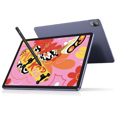
You can also check out the graphic tablets and display tablets from XP-Pen.
Subscribe to the newsletter using the form below, and we’ll make sure you get articles like these and also the latest developments in the XP-Pen community and get best graphic drawing tablets from XP-Pen.


