


Colour Psychology - Triggering Emotions With Your Art
Red, Blue, Green, Yellow, Purple, Orange, Black, White, Grey, & etc. Every colour stimulates the imagination to express feeling and emotion in an artwork.
The famous Spanish Painter Pablo Picasso said, “I found I could say things with colours and shapes that I couldn’t say any other way - things I had no words for.”
It is not an extravagance to mention that colours play a crucial role in creating artwork. There was a time when artists used water colours to create a painting on paper- but gone are the days.
With the advancement of technology and the introduction of digital graphic tablets, artists use a stylus for drawing and creating artwork that helps them evoke a whole range of emotions in viewers worldwide.
If you’re an artist looking to stand out with your creative artwork to procure the desired results, understanding colour physiology is a must.
What Is Colour Psychology?
Put simply; colour psychology is the study of colours and how they make a mental and emotional impact on people. In other words, it is the study of how different colours can cause different emotions in humans.
Today, every small, medium and big brand meticulously picks a colour to incorporate into their brand. It is simply because colours symbolize different emotions and feelings.
It becomes pretty easy for anyone to understand a lot about the brand by merely analyzing its hues.
Every business uses colour deliberately in their product designs, advertising, packaging, and websites. It is because the colours will easily enhance the mood of their target audience and thus generate more leads.
Therefore, as an artist and a graphic designer, you must learn about colour psychology to create exceptional artwork using a graphic tablet with screen.
Also Read : Types of art therapy for stress relief.
Stimuli Associated With Colours
According to Kiff Holland, an artist, “colour creates, enhances, changes, reveals, and establishes the mood of the painting.” Undoubtedly, every colour evokes some emotion and mood that trigger the people.
Whether you’re a brand or graphic designer, we have mentioned a rundown of different colours that will help you create the desired logo or painting.- Red
Red colour falls in the category of warm colours, which is associated with romance & excitement, but also blood & fear.
As an artist, you can use red colour to create an energising and heating effect or an attention-grabber artwork that can help connect your emotions with your painting.
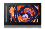
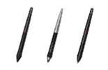
You can create a great piece of artwork with a graphic design tablet. If you’re looking for a drawing tablet with screen; then XPPen graphic tablet should be your ideal choice.
- Blue
Blue is associated with tranquillity, trust, security, peace, and readability.
As the colour also signifies loyalty, calmness, masculinity, and intellect, it falls into the cool colours category.
In a negative tone, it can be considered to reflect cold, depression, sadness, etc. Pablo Picasso used dark blue colour to evoke feelings of sadness and emotions.- Orange
An extravagant colour, orange is considered a vibrant and joyful colour. Being a warm colour, it is full of warmth, motivation, fun, freedom, courage, friendliness and success.
You can use this colour to stimulate and instil freshness, sensuality, energy, and playfulness.- Yellow
Yellow also comes into the category of warm colours. It is the colour of happiness, energy, brightness, and intellectuality. It also symbolises creativity, cheer, enlightenment, and creativity.
Since the yellow colour has a wavelength, it is visible and easy to see. However, avoid using too much yellow as it can create irritation, anxiety, frustration, and anger.- Black
Black is a neutral colour associated with seriousness, sophistication, control, and independence. In western culture, colour is associated with morbidity and death.
Graphic designers must use black colour to convey authority, power, and class in their artwork. So, use a graphic tablet with a screen for the artwork you want to create.- Purple
Known for royalty, the colour analogues wealth and respect. Purple is a cool colour which can help you create dynamic effects in your artwork.
This colour is highly used on holy days in the catholic church as it signifies spirituality. Indeed, it is a colour of magic and mystery, but excessive use of it will look bad.- Green
It is a harmonious colour that encourages a calming, relaxed attitude, filled with hope and healing. The green colour is considered to be more relaxed and calmer.
As an artist, you can use green colour to represent health, earth, environment, freshness, healing, and hope.- Pink
Synonymous with femininity, pink is a more soothing colour than stimulating. This colour evokes love, infatuation, happiness, compassion, tranquillity, and warmth.
However, too much pink can seem immature and draining. Use a drawing tablet with a screen to create an artwork by integrating pink colours.- Brown
Considered a neutral colour, brown is associated with comfort and warmth and evokes sensual feelings, including chocolate, coffee, and earth.
Further, it offers comfort, security, protection, support, and structure. Make sure to use the stylus for drawing to create breathtaking artwork.- White
White is often associated with peace, innocence, goodness, equality, balance, cleanliness, tranquillity, refreshment air, open space, etc.
You can create white colour-based concepts or ideas in your artwork. However, too much white can create ideas of loneliness, isolation, and emptiness.
Also Read : Basic Graphic Design Principles
How To Pick Your Palette Correctly?
Whether you are an artist or a graphic designer, you must have a clear concept for your printed poster design.
So, it will be pretty straightforward for you to pick a colour that goes best with the kind of emotional response that you want to trigger among your target audience.
However, you need to learn the art of creating a colour scheme for the best effects.
To choose the right colour palette, start by choosing different colours (cool, warm, and neutral), then create a colour scheme (monochromatic, analogues, complementary, and contrast) that best fits your style, and finally, try different colour tones.
This way, you will be able to pick the right colour palette you want for creating exceptional artwork.
If you’re looking for a tablet for drawing with a stylus, count on XPPen. We are a leading digital graphic design tablet manufacturing company in India.
We value art/ painting/ and graphic designs; therefore, we come with innovative tablets made with advanced technology. Get yourself the best drawing tablet with screen from XPPen today.
FAQ's
1. What is the color for mental health?
- There isn't a specific color universally associated with mental health. It can vary, but often green is used to symbolize mental health awareness.
2. What are the 4 psychological Colours?
- The concept of "psychological colors" isn't a recognized psychological term. However, colors can have different psychological effects on individuals, with red associated with stimulation, blue with calmness, yellow with happiness, and green with balance.
3. What is the color for mental health?
- There isn't a single designated color for mental health, but green is often used to promote mental health awareness and well-being.


